What Makes a Room Feel Finished Without Looking Overdesigned
A finished room and an overdesigned one are easy to confuse until you're living in it. The difference turns on restraint, functional logic, and one overlooked variable.
There's a specific discomfort that comes from rooms that have been designed rather than inhabited. Everything matches. Every surface has a considered object on it. The throw is draped at exactly the angle a throw gets draped when someone was paid to drape it. And the room feels, unmistakably, like a set.
A finished room and an overdesigned room are not the same thing, and the difference is worth understanding before you invest in either direction. The tension that most decorating advice skips: the cues that signal "finished" to a viewer are nearly identical to the cues that signal "overworked" to a person living there. The difference is functional logic—whether the design choices serve the people in the room or serve the look of the room.
That distinction lands differently when you're the one choosing between a second decorative pillow and a lamp that actually illuminates what you need to see at 10 PM.
The Difference Between Finished and Overworked
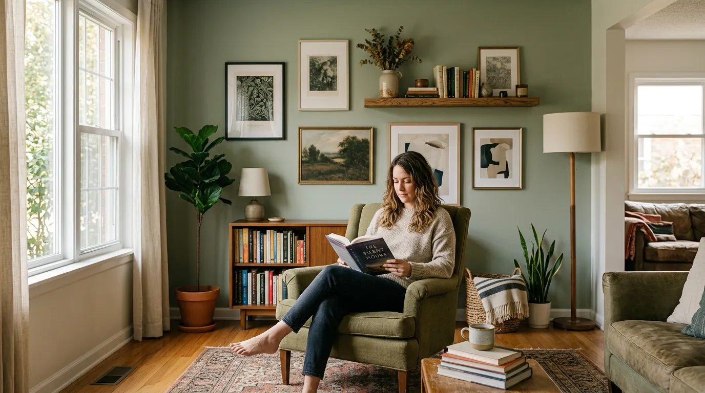
A finished room has resolved its main visual problems: furniture scale feels right, there's enough light for actual use, the traffic paths are clear, and there's at least one surface that functions as a landing spot without being designated as one. None of these require spending more money. Most require making fewer purchases rather than more.
An overdesigned room has resolved its styling problems instead. Every corner has been addressed. Negative space has been filled. The eye has somewhere to go in every direction. That sounds like a compliment. In a room you're going to live in, it's exhausting. Visual busyness that reads as richness in a 30-second photo read produces low-grade fatigue over a two-hour evening.
The practical marker that distinguishes them: can you add one messy, lived-in element—a book left open on the coffee table, a coat over a chair back—without the room looking wrong? A finished room absorbs that. An overdesigned room breaks. It was calibrated to a state of order that real occupancy disrupts.
The Overlooked Variable: Visual Rest Points
What gives a room the settled, finished quality without looking overdone is the presence of intentional negative space. Not empty space because you ran out of budget or ideas—deliberately unoccupied surfaces and corners that give the eye somewhere to stop and rest.
This runs directly against the instinct most people act on when a room feels unfinished. The room feels incomplete, so the answer seems like more. Another piece of art. Another plant. Another throw. Sometimes the right answer is to remove one thing that's working hard and let the space next to it breathe.
Put more precisely: the problem isn't the quantity of objects. It's whether each object has enough visual breathing room to read as intentional rather than accumulated. A single good piece of art with wall space around it communicates confidence. Four pieces hung close together communicate uncertainty.
One strong object with clear space reads as a choice. The same object surrounded by supporting objects reads as hedging. And hedging is detectable—not intellectually, but in the slightly unsettled feeling a room produces when you can't identify the main idea.
What Actually Makes a Room Feel Done
Three things, and the third one is the one nobody mentions enough. First: a single clear focal point per room—one element that the arrangement reads as centered on. It can be a fireplace, a large piece of art, a window with a view, or even a particularly good piece of furniture. The room needs one. Two focal points create competition. Zero creates drift.
Second: light that works for actual use, not just appearance. A room that's lit for photography is dim for reading, cooking, or the kind of conversation that happens over a long evening. The finished-feeling rooms in real life have light at multiple heights and levels that can be adjusted based on what's happening.
Third—the one most guides skip—is the presence of at least one object that is clearly personal rather than decorative. Not a family photo necessarily, but something that could only make sense to the person who lives there. A specific book left out, a piece brought back from somewhere, a tool from a hobby displayed without apology. That object signals occupancy. It tells the room a person lives here rather than a designer passed through. That signal is the difference between finished and staged.
If you do nothing else, add that object. It costs nothing and changes the room's reading more than the right throw pillow ever will.
When Restraint Goes Too Far
There is a version of this advice that produces rooms that are correct but cold. Rooms with one focal point, adequate light, and a personal object, but nothing warm enough to sit in for more than twenty minutes. Minimalism as an aesthetic is easy to describe and harder to inhabit, and the version of it that appears in design content often strips a room past the point of comfort in pursuit of the visual of restraint.
This applies most directly to people who are renovating or decorating after a life change—a move, a separation, a transition—where the impulse toward a clean, edited space sometimes tips into spaces that feel provisional rather than chosen. A room that looks like you haven't committed to it yet produces a specific low-grade discomfort. The personal object matters especially here. So does warmth at floor level: a rug, not as styling but as thermal and acoustic material. These are the corrections for a room that has gone too far toward minimal.